The DOs + DON’Ts of Condo Decorating
Anyone who says you can’t make a small condo feel like a beautifully designed oasis just isn’t thinking big enough.
When it comes to condos, you need to get a little creative with how you’re utilizing your space, and there are a number of common mistakes that plenty of people make that can quickly make your apartment feel a lot smaller (and more cluttered) than it has to.
Of course, we all have our own unique styles, so there are no hard and fast rules. But if you’re looking for some basic guidelines to follow when it comes to condo decorating, here are a few DOs + DON’Ts to keep in mind.
DO — Heighten the appearance of ceilings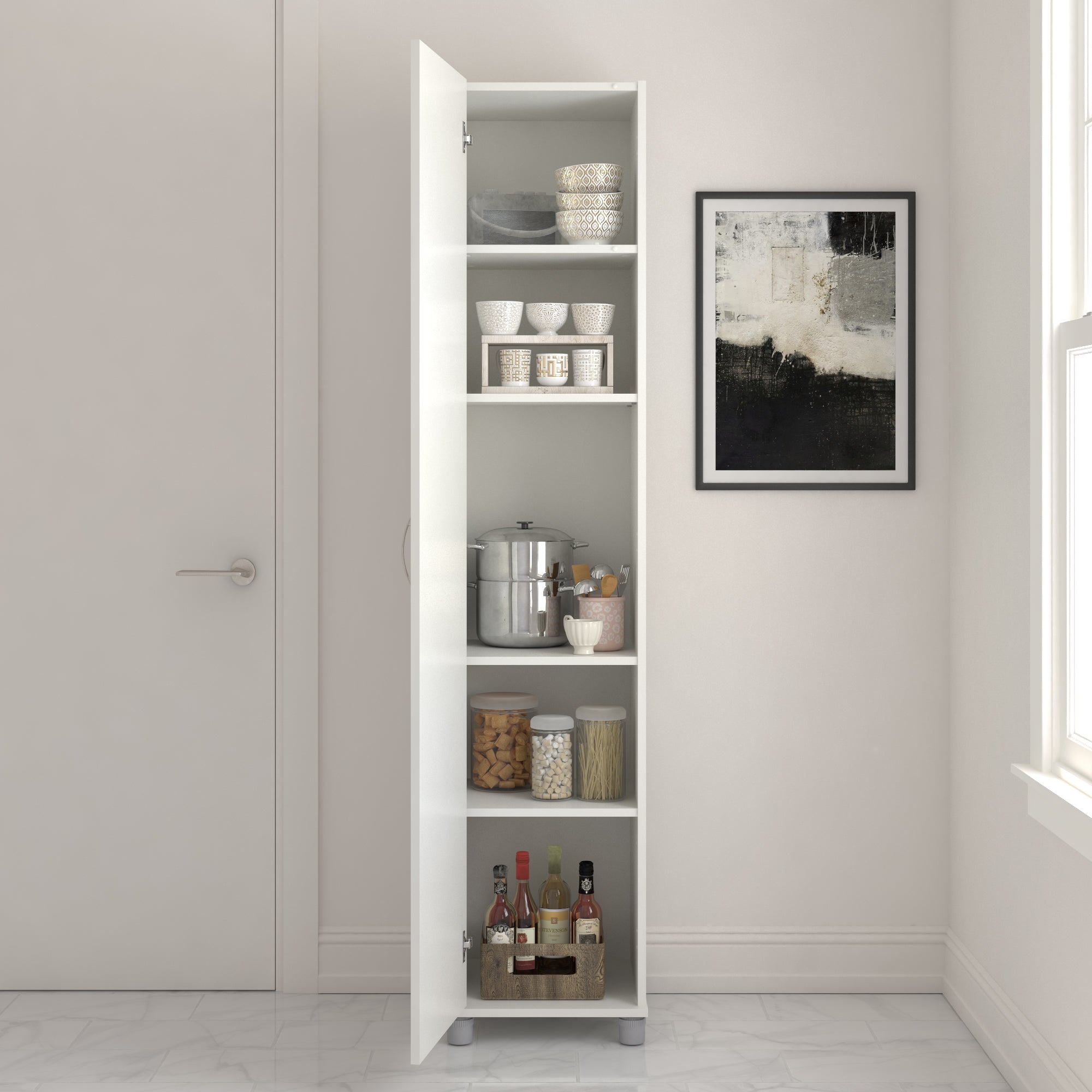
If you were lucky enough to land a mid-century gem of an apartment with soaring ceilings — congratulations, and we’re definitely jealous. But when it comes to most modern condo buildings, you'll have to get a little more creative in order to achieve the look and feel of vertical space. Fret not! There are a few simple techniques you can deploy to achieve this transformation.
Let's start with lighting. One of the easiest and most cost-effective ways to heighten the appearance of your room is to use what's called "uplighting" — which basically describes upwards pointing light fixtures that can help discreetly dramatize your walls. We're not talking about full-on flood lights, but rather small LED fixtures or vertical wall sconces that point towards the ceiling. It could also be something as simple as a tall, upward extending lamp. Try hiding one behind a plant or strategically placing it in corners to bring some vertical depth into your space. And if possible, try avoiding ceiling lights like chandeliers and overhead fan fixtures, which naturally draw attention to low ceilings.
You can also achieve a high ceiling effect by adding tall, skinny furniture pieces such as bookcases and cabinets that draw the eye upwards. Another fool-proof solution is floor-to-ceiling curtains with flowing textures that also help to create the illusion of larger windows + natural lighting.
DON’T — Feel like everything has to match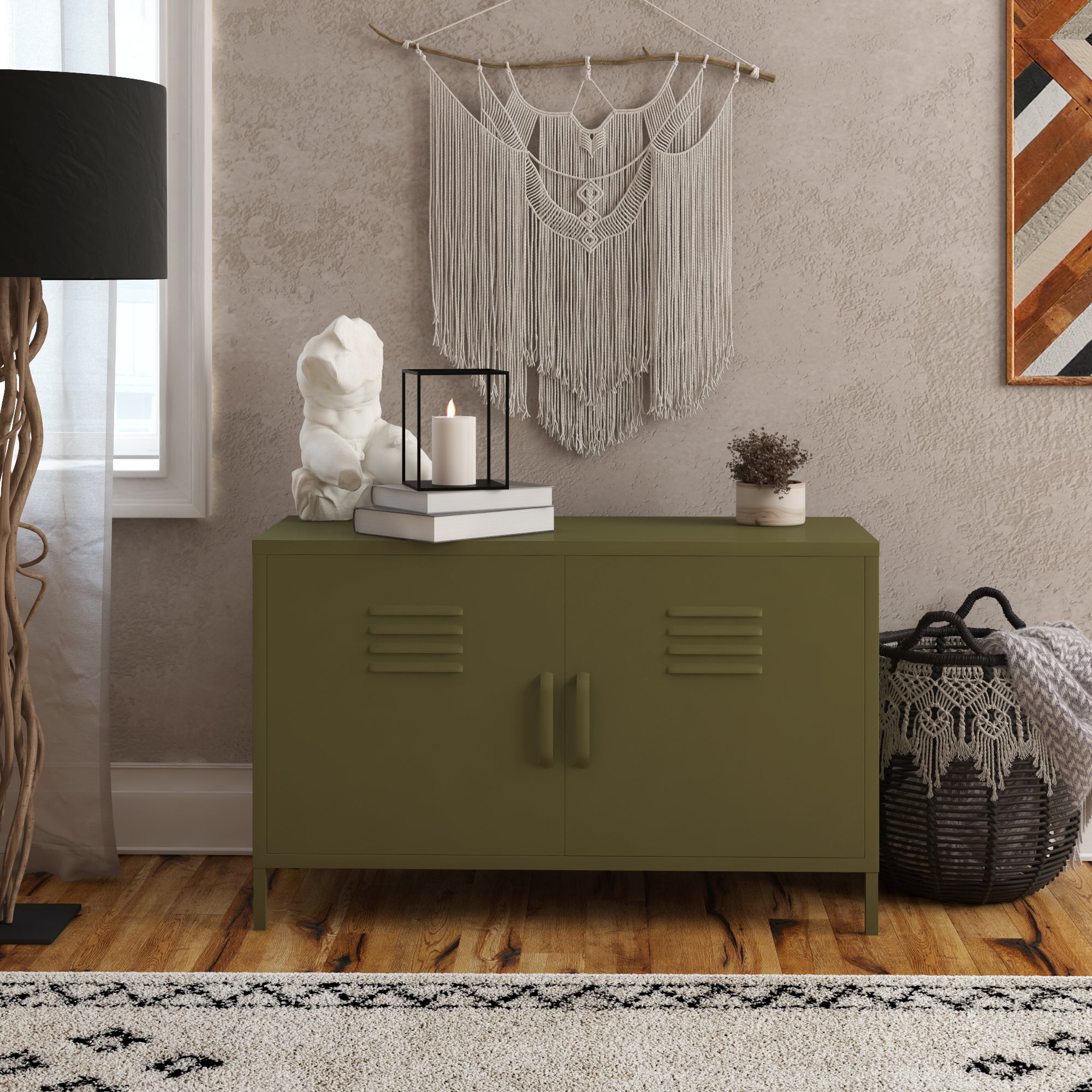
Trust us, we love a good matching set — but if your futon, dinette table, counters and kitchen all look like they came out of the same showroom, your space will just blend together into one homogenous blur.
There are some exceptions, of course. Modern minimalist styles often tend to rely on a heavy dose of clean whites to achieve an immaculate (albeit difficult to keep clean) look. There’s nothing wrong with taking color and pattern cues from your furniture and décor items and weaving a cohesive look throughout the rest of your space. Remember, contrasting textures and styles can be a good thing. If your space feels too stark, consider adding an antique touch to balance out the vibe or maybe consider a really striking area rug to contrast the neutral colors of your walls.
DO — Go timeless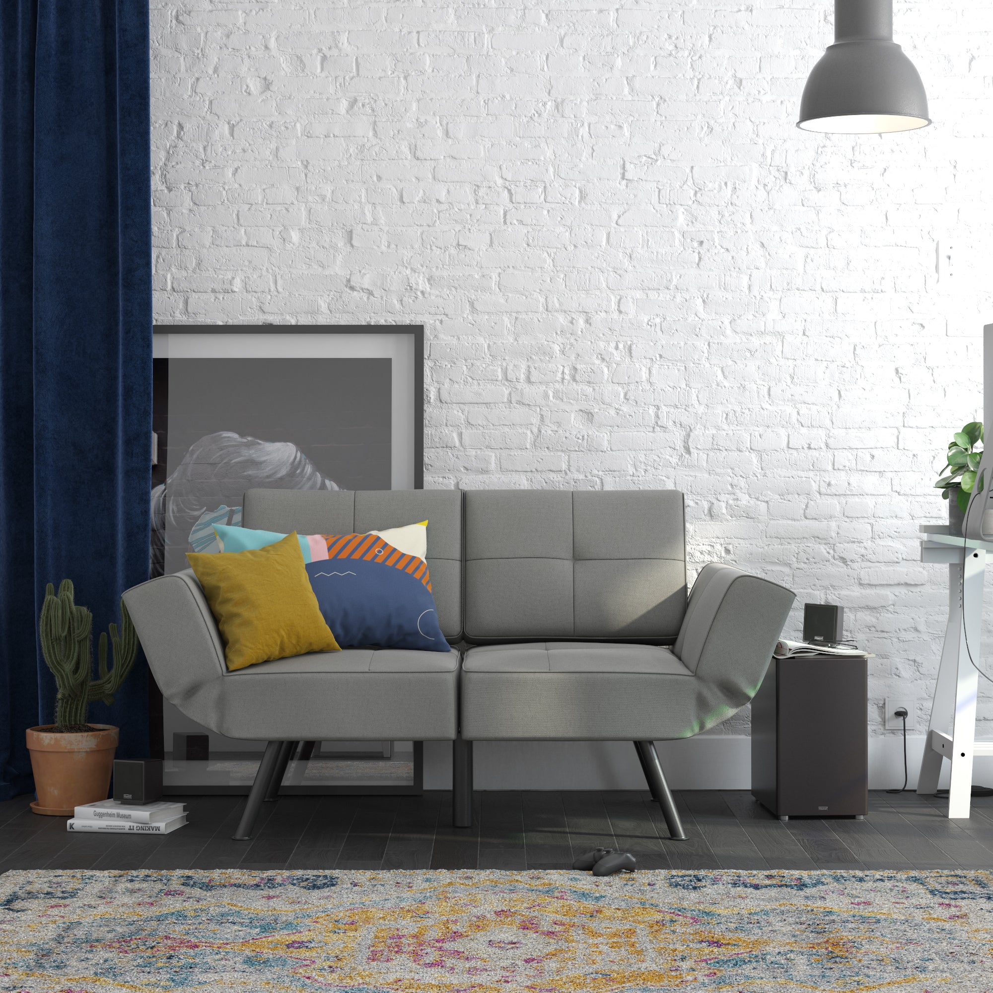
Just like in the world of fashion, interior design trends often follow a cyclical pattern. What is old is new again. And though we don't anticipate your grandma's burnt orange shag carpeting to come back into style anytime soon, some new trends might quickly arrive after you have finalized your design plans. So, unless you have your own dedicated team of stagers on-call to keep up with the constantly changing trends, you’ll probably want to choose styles with a little more staying power. Time-tested styles like our Euro Loveseat Futon will integrate nicely into almost any surrounding environment, and rustic woodgrain textures are always a versatile choice when it comes to tables and bed frames.
Longevity is also really important when it comes to your walls. You may currently be obsessed with that vintage floral print wallpaper (and hey, maybe it really is the one for you!), but understated palettes and hard-working neutral colors will give you a much better canvas to work with in the long run. Plus, you can always achieve that bold pop of personality with a smaller accent piece that can be easily swapped in and out as your style evolves.
DON’T — Block your flow of movementNaturally, nobody likes feeling trapped. It’s super important that you and your visitors can move around your condo freely without stubbing toes or having to dance around boxed-in areas. For example: a big sectional sofa is often a tempting choice, but if it takes up over 50% of your living room area, you’re probably better off with a plush and comfy futon that opens your space up, while also pulling double-duty as a guest bed.
Before you go ahead with any big furniture purchase, bust out a measuring tape and give yourself a true visual representation of how the furniture piece will fit into your space. While you’re at it, don’t forget to measure out your front door + elevator to make sure those deliveries will fit inside without too much squeezing and/or sweating!
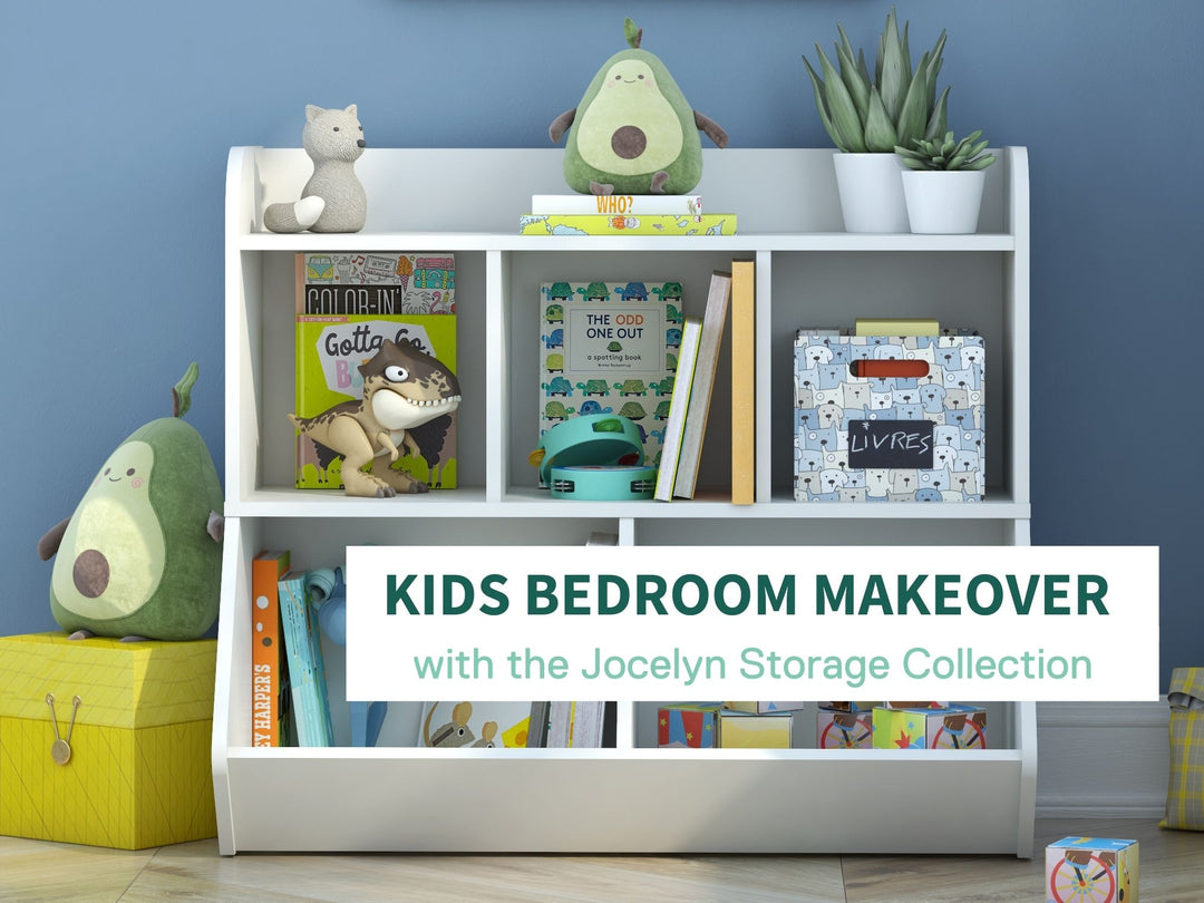
DO — Get creative with storage space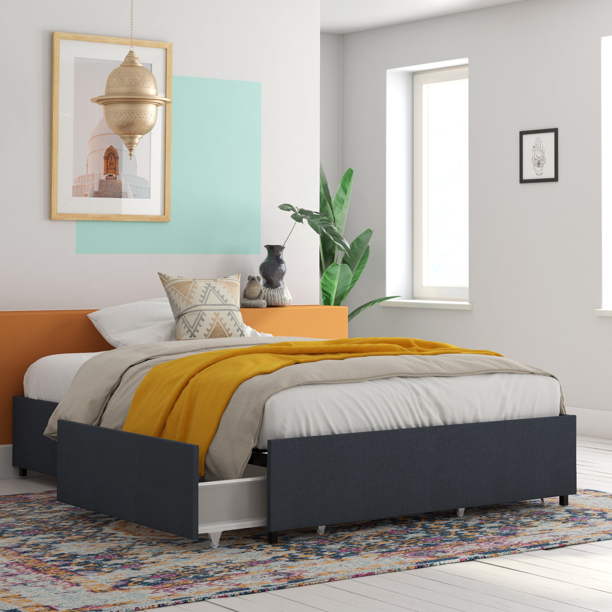
Once you have everything looking amazing, there’s the small matter of where to put all that stuff you own. Easier said than done! Your first step may require a major Marie Kondo-ing of your belongings, but with a little bit of creative storage design, you shouldn’t have a problem finding a home for your favorite things.
Multi-functional furniture is the name of the game when it comes to condo storage. Our Alden Platform Bed is an excellent example, with built-in storage so you can discreetly stow away clothes and personal items without cutting into precious closet space. The same goes for your office/workstation, where desks with built-in shelving can effectively de-clutter your workspace and open up more surface for art pieces or indoor plants.
* * * *
At the end of the day, everyone has a different vision for their condo. If you really love a certain piece, then it may very well be worth sacrificing a bit of space for. But in most cases, we always recommend a “less is more” approach, embracing timeless styles and multi-functional storage to maximize both utility and comfort.
What kind of condo styles do you love? Tag @RealRooms on social media and show us what’s working for you!


